The four colour styles
Every theme ships with four colour styles. Open Appearance → Editor → Styles and click a style to preview it on the whole site, then save.
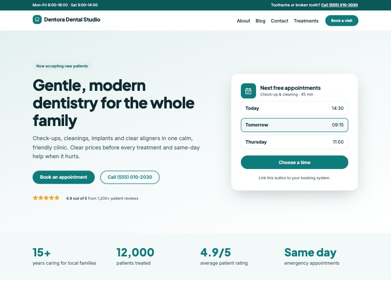
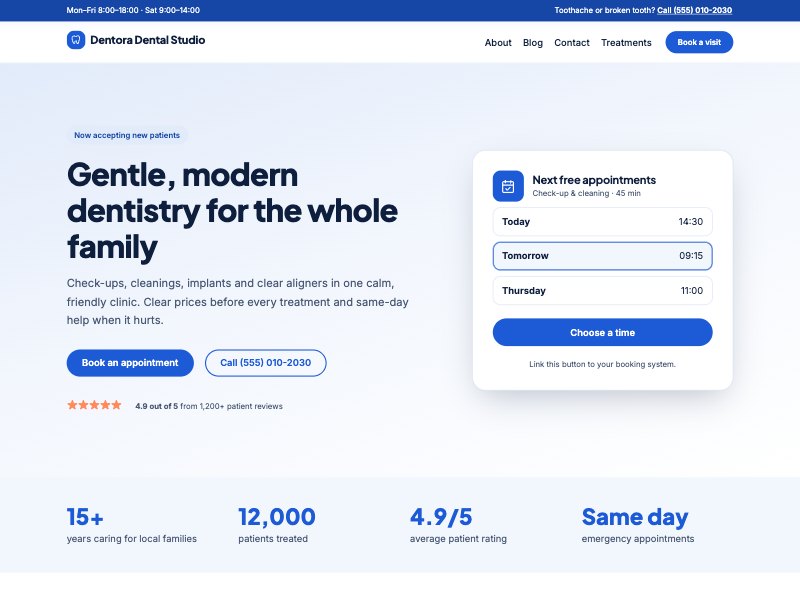
Use your own brand colour
- In Styles, open Colors and then Palette.
- Change Primary to your brand colour and Primary deep to a darker shade of it.
- Adjust Surface and Surface 2 to very light tints of the same colour.
- Save. Buttons, links, icon tiles, the brand mark and highlights all update.
Keep enough contrast: white text must stay readable on your Primary colour. If buttons look washed out, pick a darker Primary.
Fonts
The themes bundle their fonts (no Google Fonts requests, which helps privacy and speed). Change them in Styles → Typography. You can install more fonts from the Font Library in the same panel.
Logo and site icon
- Add your logo with the Site Logo block in the header (Site Editor).
- In the Site Logo block settings you can also use the logo as the site icon (browser tab icon).